Power Extreme Innovation with Intelligent Computing™
Power Extreme Innovation with Intelligent Computing™
Overview
Accordions
Breadcrumbs
Button
Cards
Chips
Date Picker
Dropdowns
File Upload
Loading Indicator
Navigation
Search
Selection Controls
Snackbars
Table
Text Fields
Tooltips
Overview
Accordions
Breadcrumbs
Button
Cards
Chips
Date Picker
Dropdowns
File Upload
Loading Indicator
Navigation
Search
Selection Controls
Snackbars
Table
Text Fields
Tooltips
Overview
Philosophy
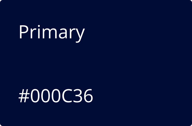
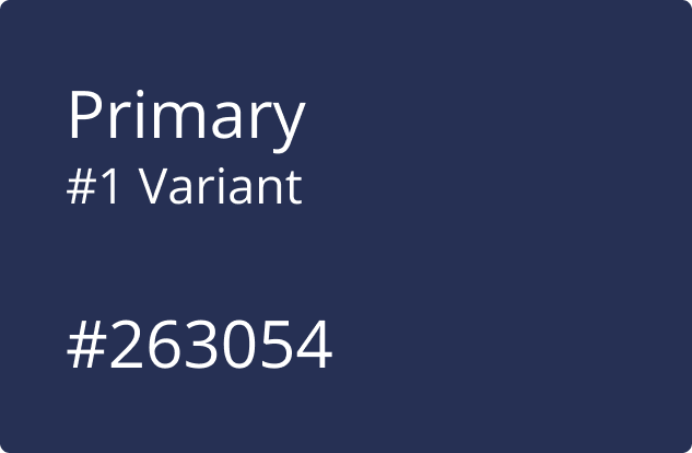
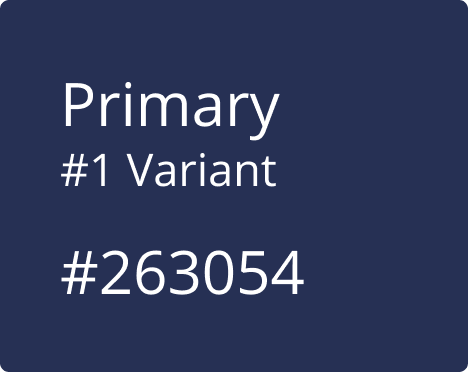
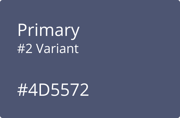
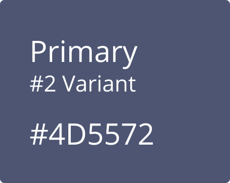
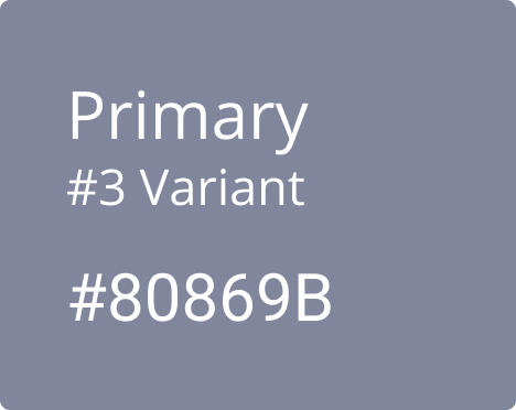
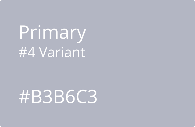
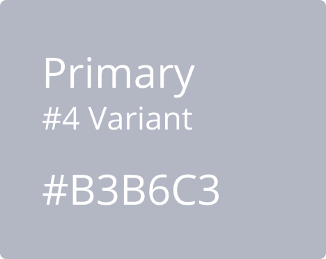
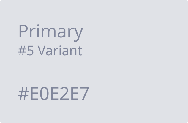
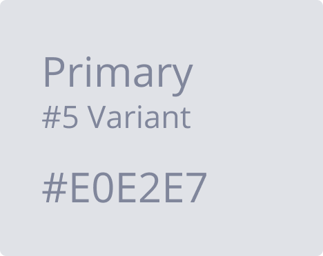
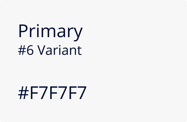
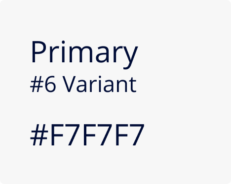
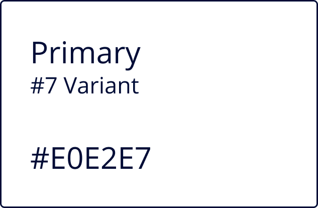
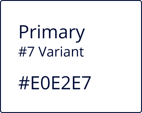
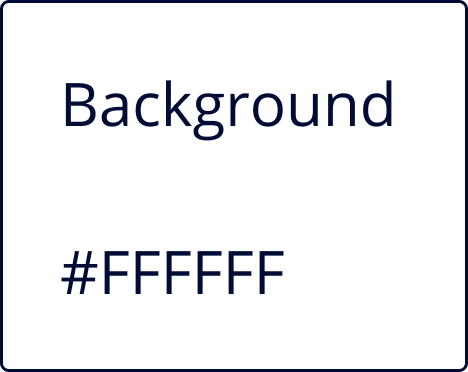
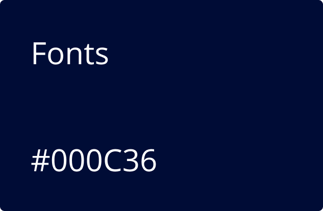
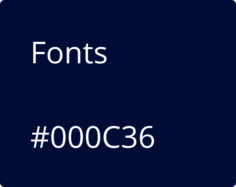
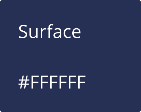
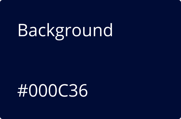
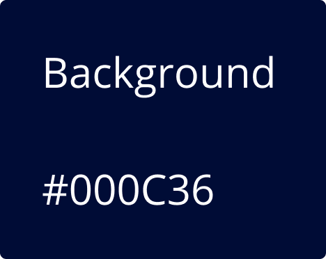
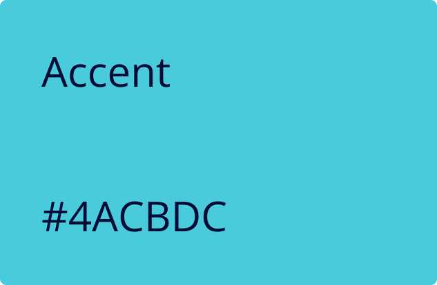
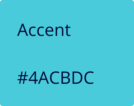
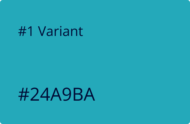
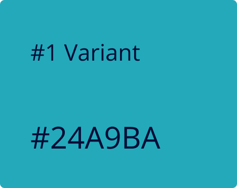
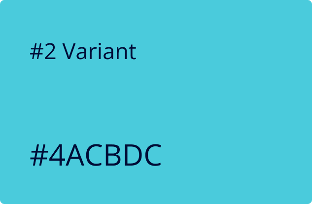
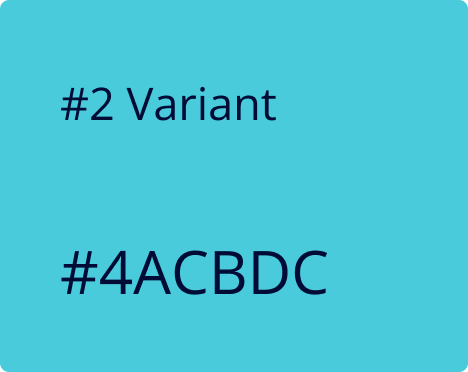
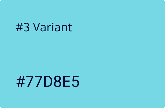
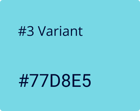
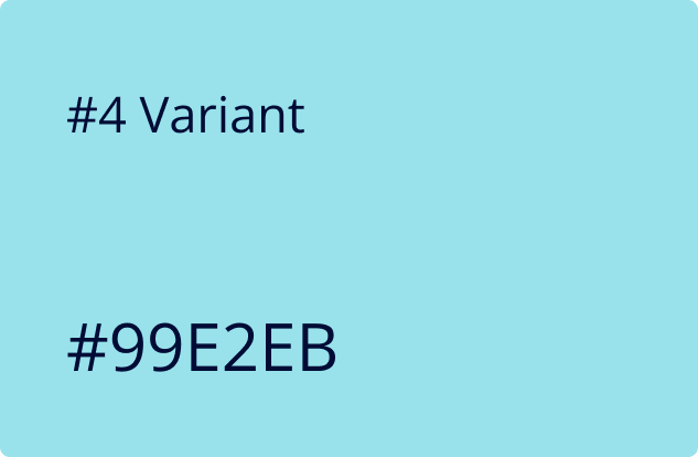
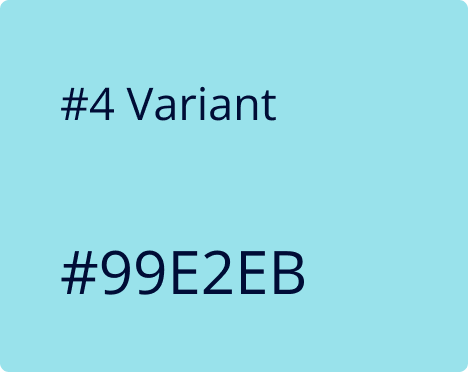
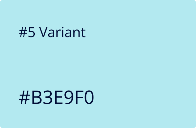
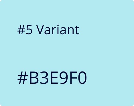
Color
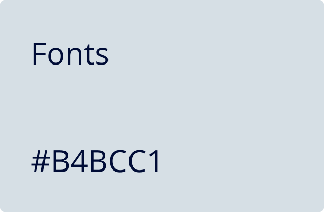
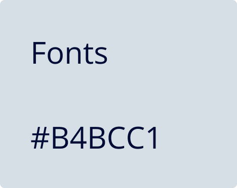
Typography
Our Design Philosophy
As technology continues to advance at a rapid pace, it has become a growing
necessity to achieve technological literacy in order to keep up with the pace of
modern society. As designers, we strive to be the bridge between technology and
humans through powerful, yet simplistic designs. Here at US AI, we embrace a
human-centered design approach where we understand the problem and challenges users
face, design an end to end experience, reimagine their workflow and ensure our
product suite provides the best possible user experience to enrich our user’s day to
day lives.
Collaboration
Collaboration is essential in our design process, not only between designers and
developers, but also with our users. We believe that you cannot understand good
design if you don’t understand the people. The best designs come from a deep empathy
for the user, so we frequently get together with our clients to talk about their
pain points, needs, and business goals which allows us to design solutions that
cater to real-life experiences.
Simplicity
As German-born American painter Hans Hofmann once said “The ability to simplify
means to eliminate the unnecessary so that the necessary may speak.” We emphasize
utility through minimalistic design choices because good design is meant to be
experienced, rather than seen.
Accessibility
Frank Chimero, Brooklyn-based designer and author of The Shape of Design once said
“People ignore design that ignores people.” Inclusive design eliminates barriers of
use and empowers everyone to participate equally, confidently, and independently. We
leverage our extensive design system and standards to ensure our designs are
inclusive and accessible to a wide range of users.
Extreme Innovation
Our team is constantly pushing boundaries to think outside the box. Regardless of
official occupations, everyone at US AI is a designer at heart. We encourage
everyone to share their ideas, no matter how crazy they may be because openness
breeds innovation. We aim to innovate so that we can solve problems before users
even recognize they’re having them.
Continuous Improvement
Here at US AI, we are transparent in the way we share our work continuously to open
opportunities for feedback and suggestions. It is important to design with humility
and practice with an open heart to feedback as the old saying rings true, “Two
brains (or a community in this case) are always better than one.” Our designs are
deliberated across multiple teams prior to launch so that we may continuously
improve and present a powerful solution.
Base
Light
Dark
Additional
Open Sans
Usage: Headlines, Subtitles, Body & Caption
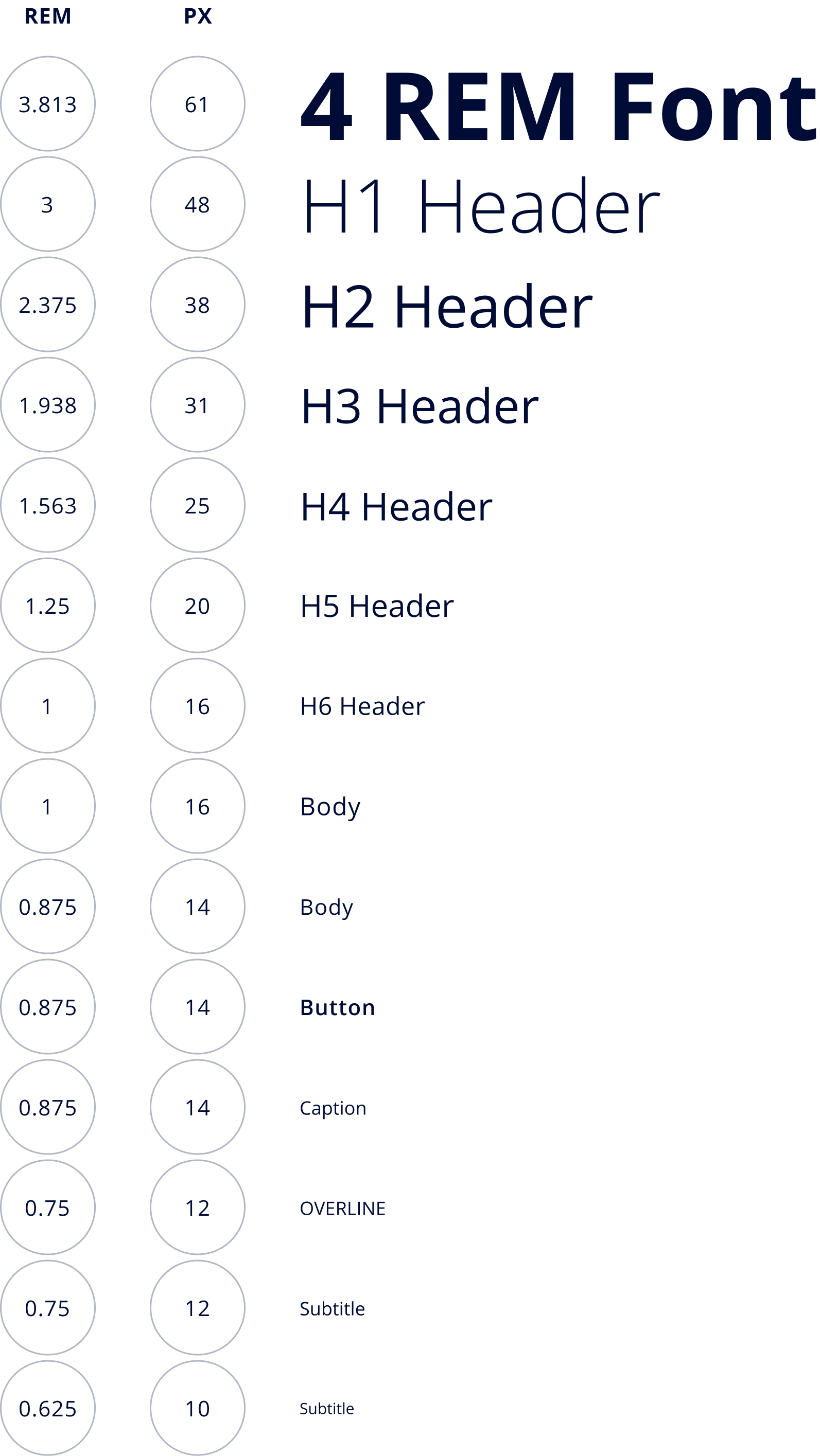
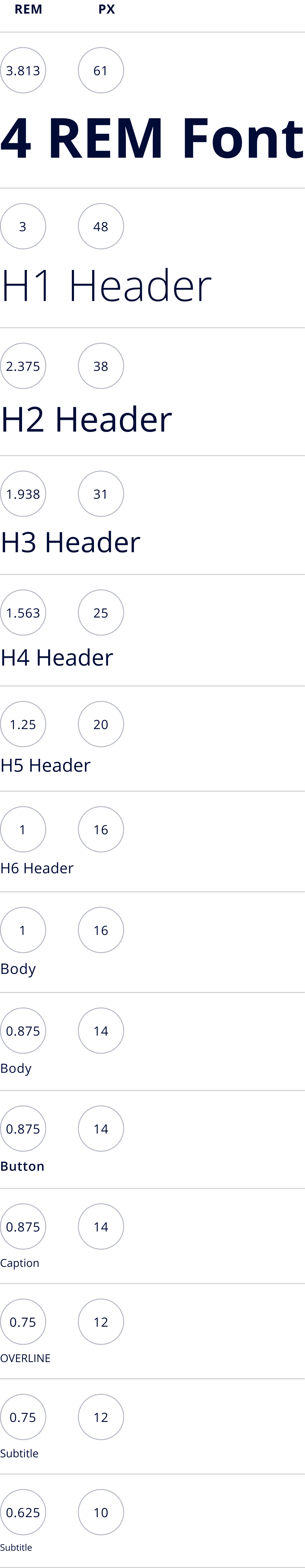
Font size units and scale
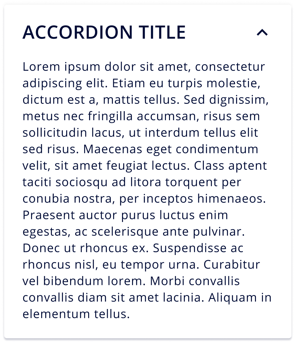
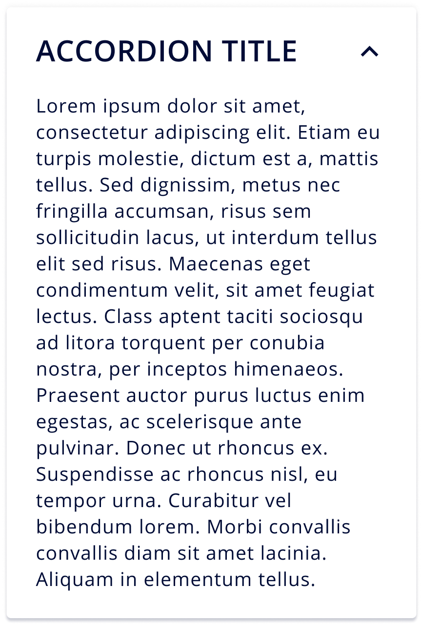
Accordions
An accordion is a vertically stacked list of headers that reveal or hide associated sections of
content
DEFAULT
HOVER
ACTIVE
Breadcrumbs
Secondary Navigation links that helps a user backtrack their footprint
Default
Current Page
Truncate
Button
It allows users to take action
Primary Button
DEFAULT
HOVER
DISABLED
Secondary Button
DEFAULT
HOVER
DISABLED
Icon Button
DEFAULT
HOVER
DISABLED
Ghost Button
DEFAULT
HOVER
DISABLED
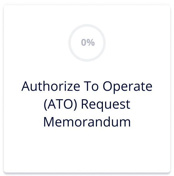
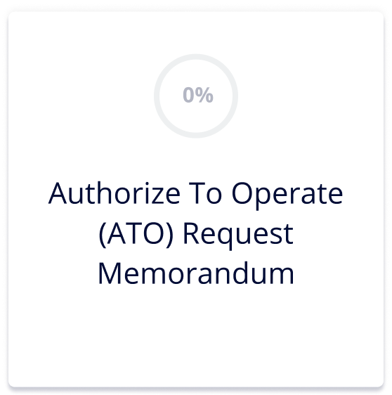
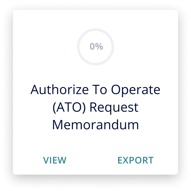
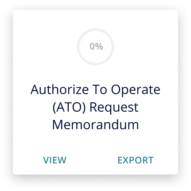
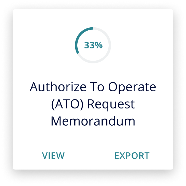
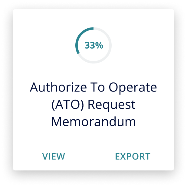
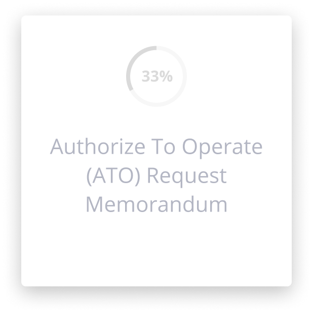
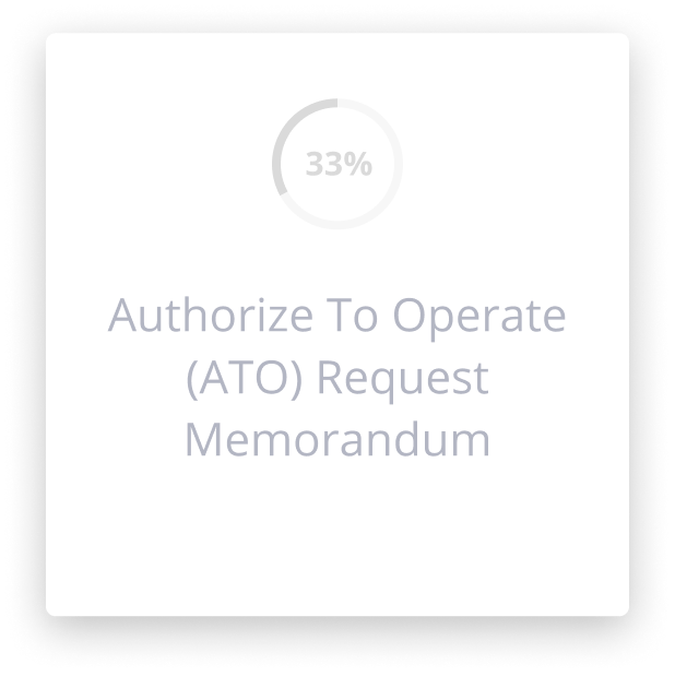
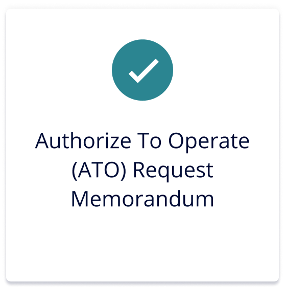
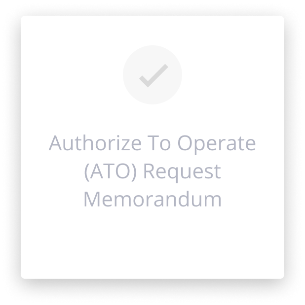
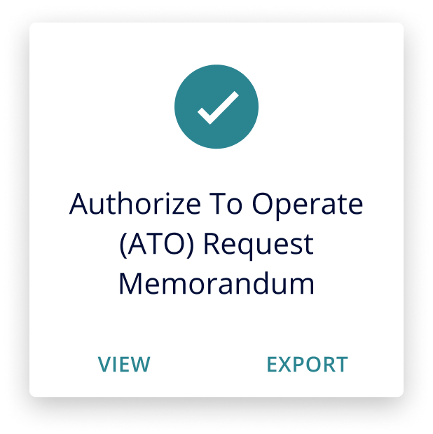
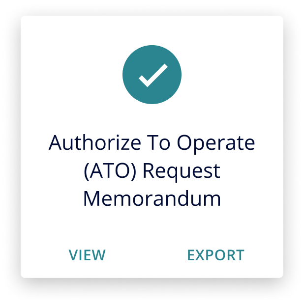
Cards
It allows users to take action
Default
DEFAULT
HOVER
DISABLED
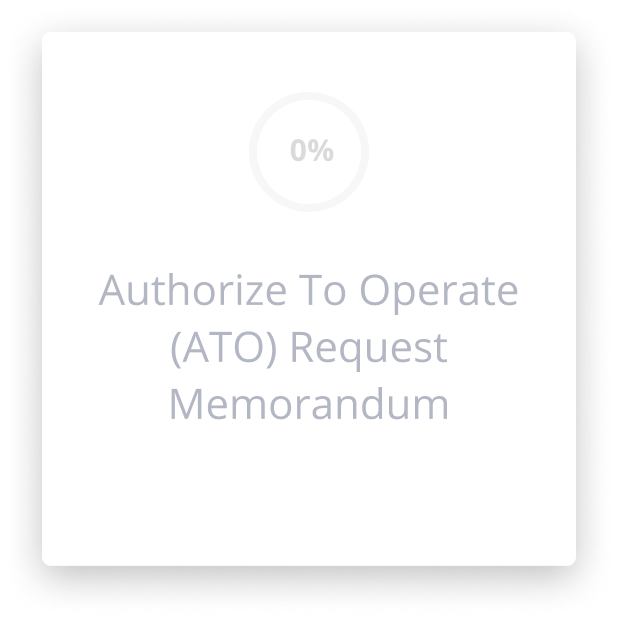
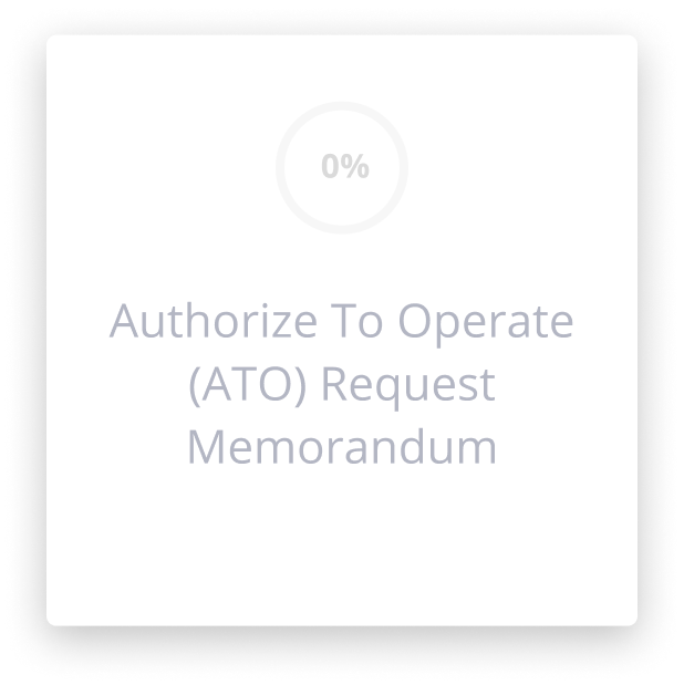
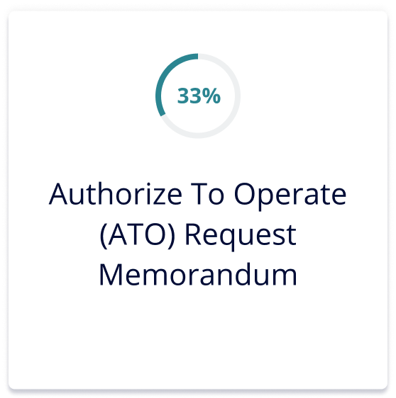
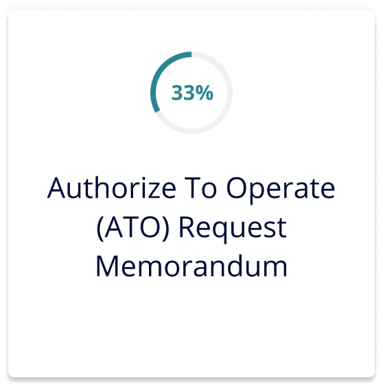
In Progress
DEFAULT
HOVER
DISABLED
Complete
DEFAULT
HOVER
DISABLED
Chips
It is used to represent an input action
DEFAULT
HOVER
DISABLED
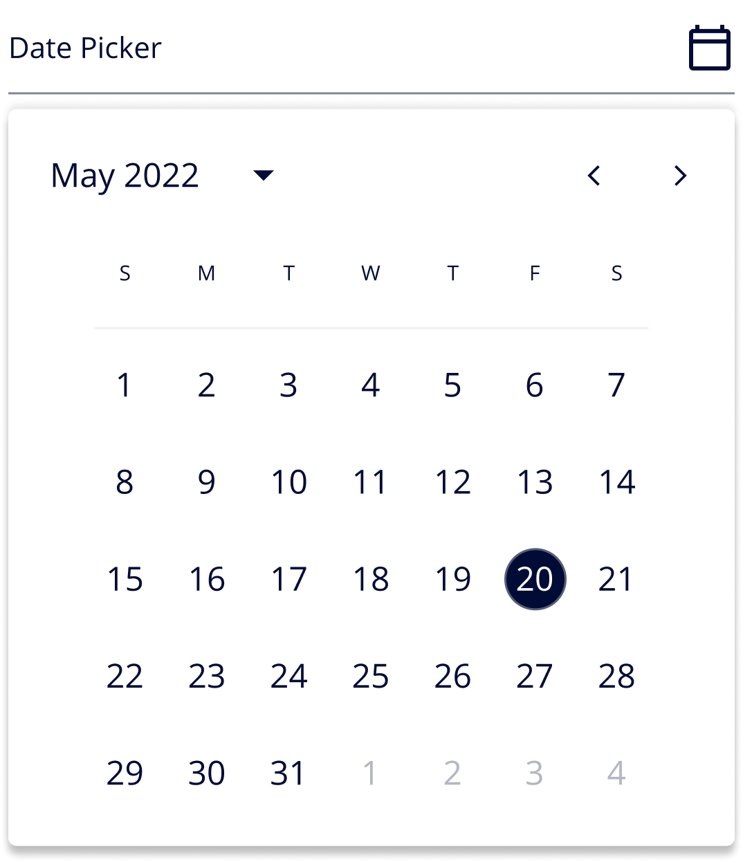
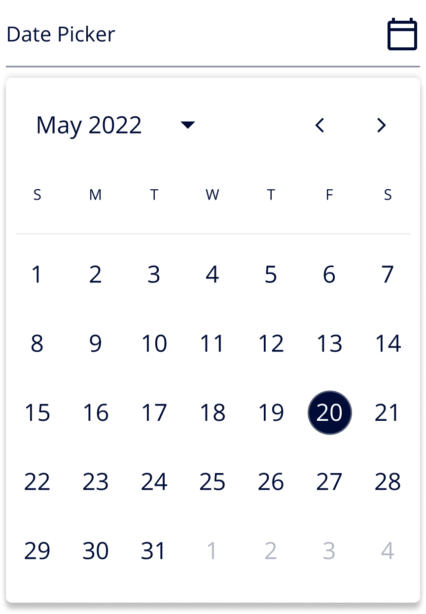
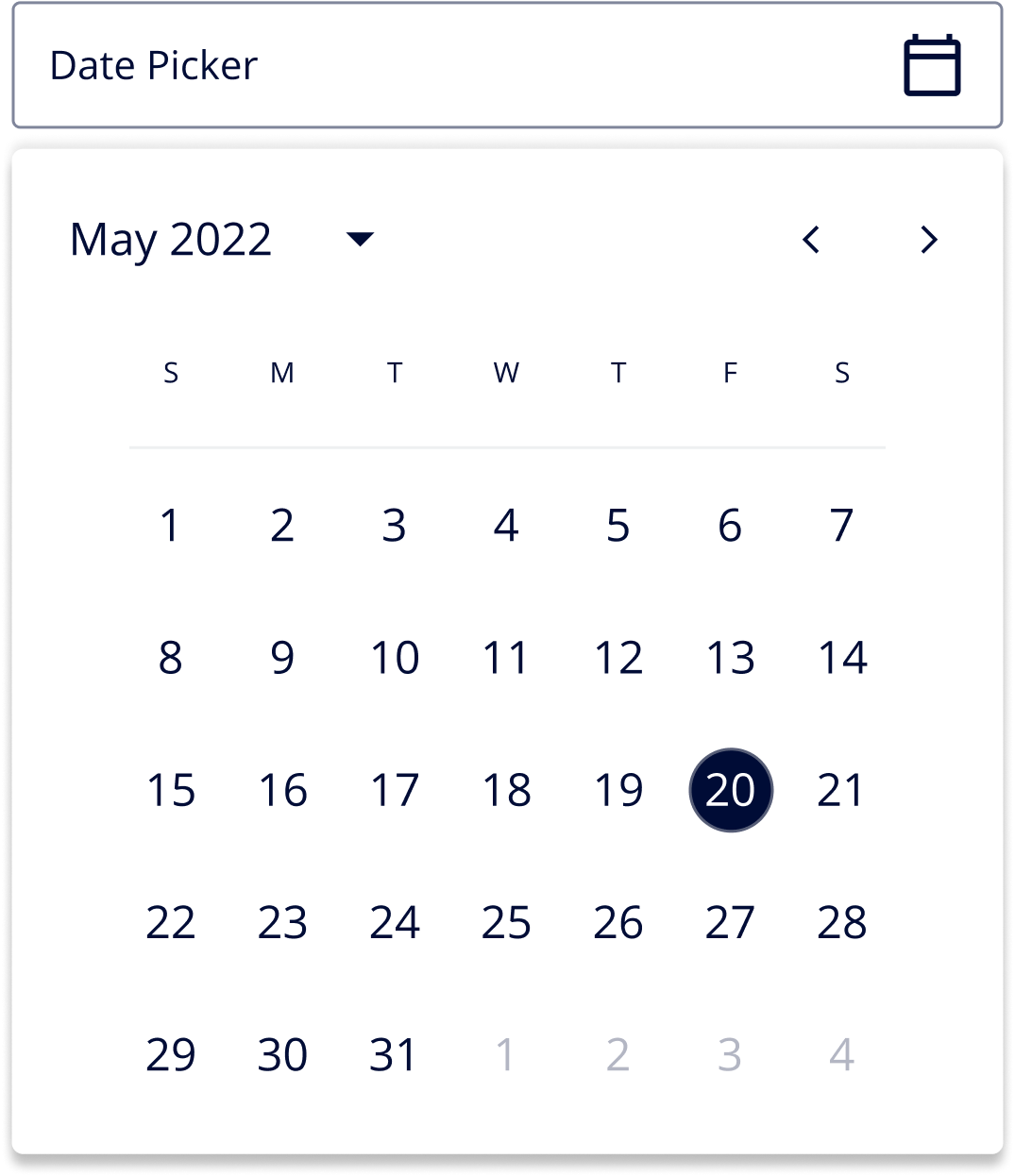
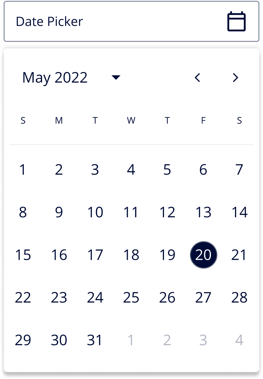
Date Picker
It allows users to select a date or a range of dates
Line
DEFAULT
Active
Outline
DEFAULT
Active
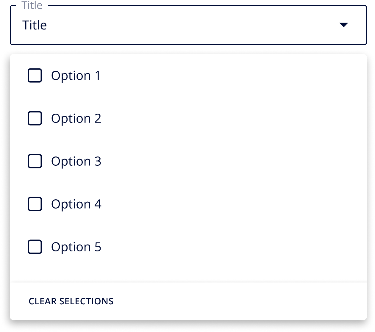
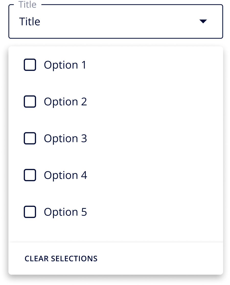
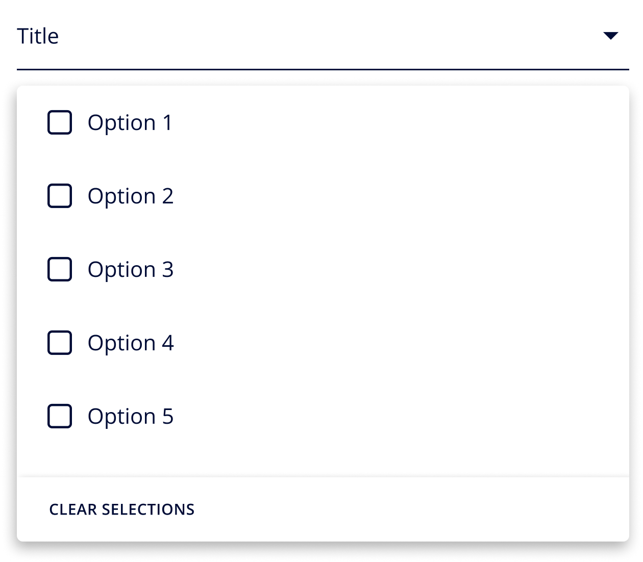
Dropdowns
It allows users to select an option from a several list of Options
Outline
DEFAULT
Hover
Selected
Disabled
Line
DEFAULT
Hover
Selected
Disabled
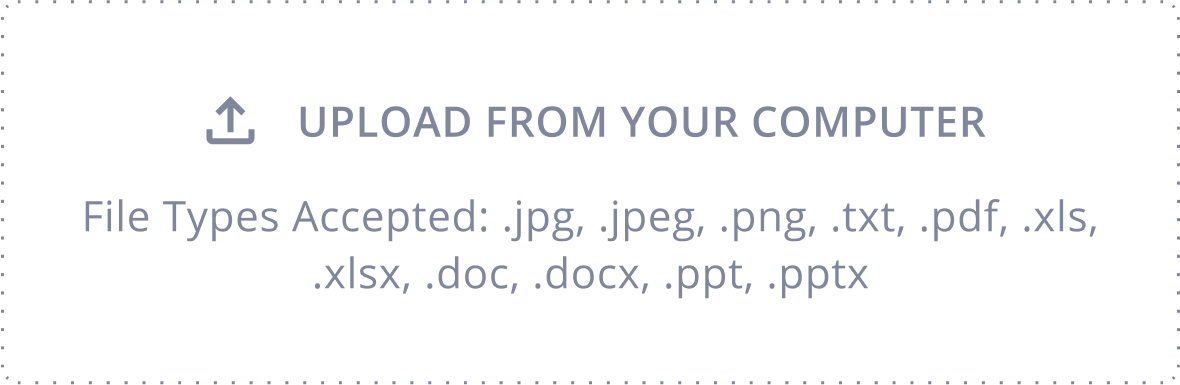
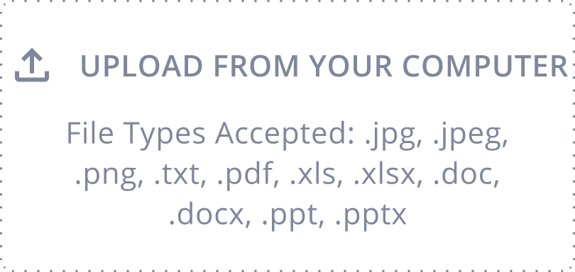
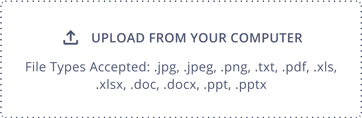
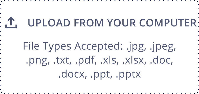
File Upload
It allows users to upload one or more files
DEFAULT
Hover
Disabled
Loading Indicator
Archangel
Forsight
Siqi
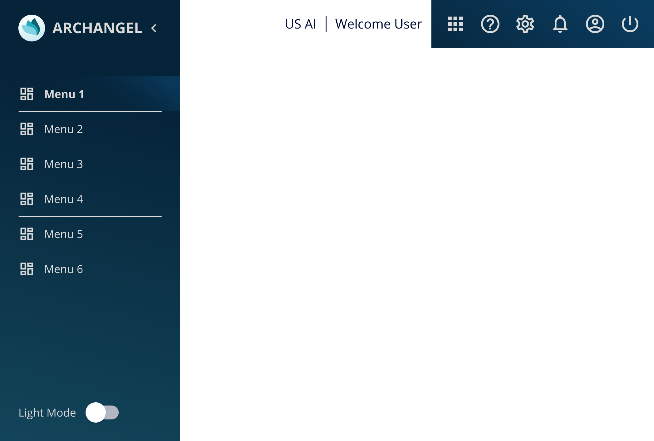
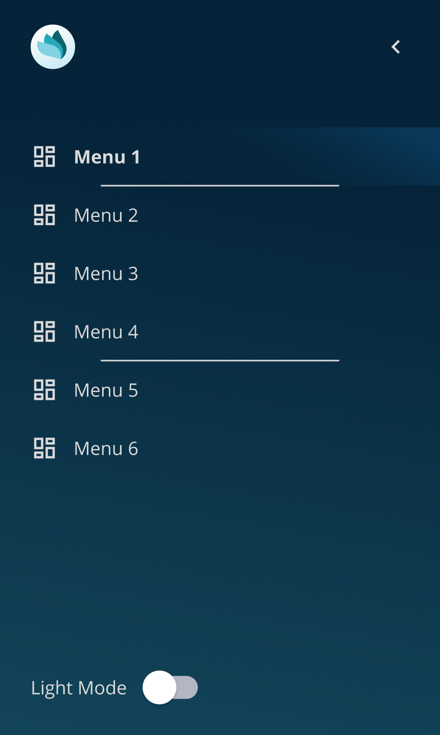
Navigation
It is used access between pages in the app or website
Global Navigation
Application Navigation
Default
Selected
Tab Navigation
Phase Navigation
DEFAULT
in progress
completed
Search
It allows user to search relevent contents without navigating
DEFAULT
Hover
Selected
Disabled
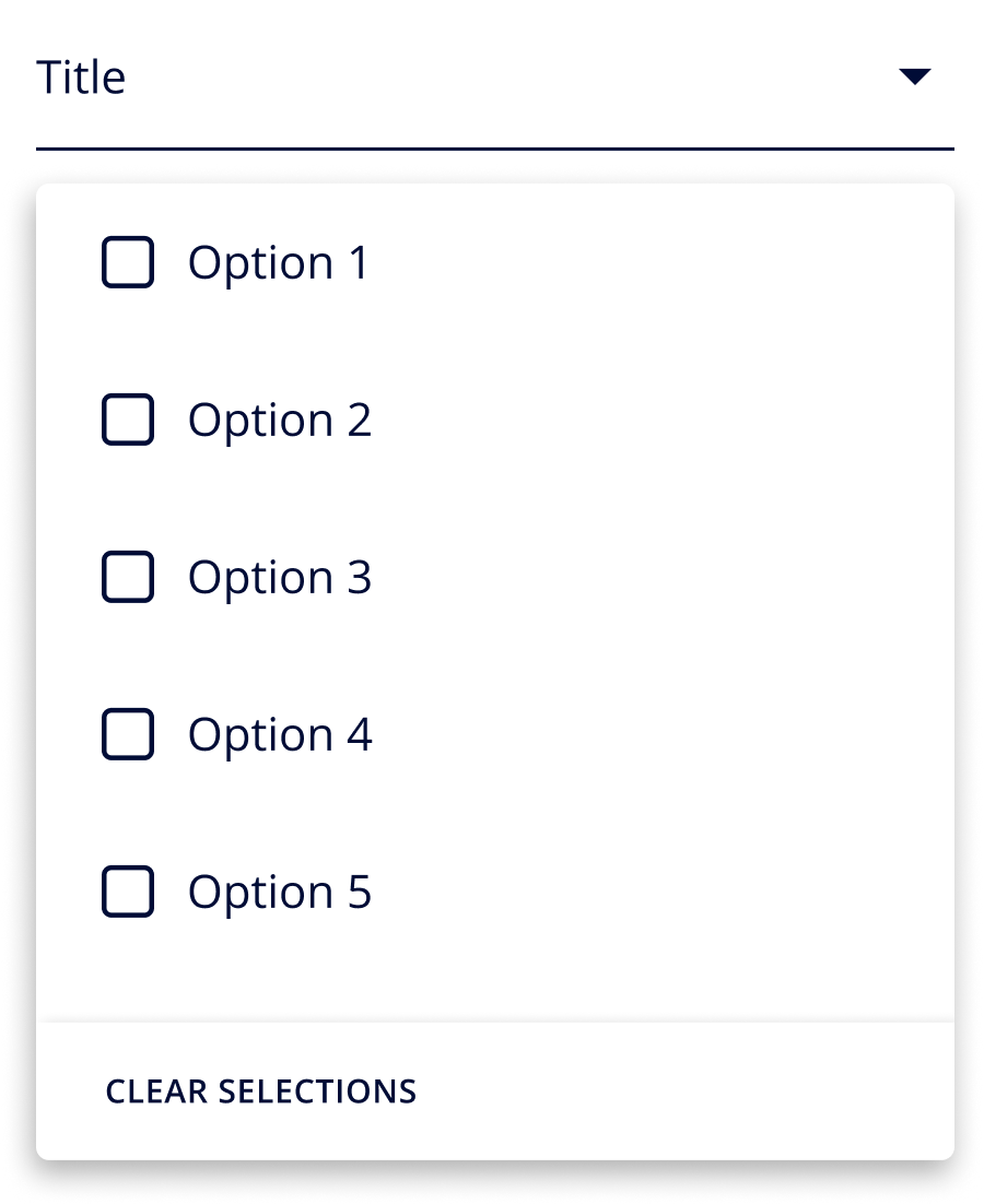
Selection Controls
It allows user to select preferred options
Checkbox
DEFAULT
Hover
Selected
Disabled
Radio
DEFAULT
Hover
Selected
Disabled
Switch
Switch 1
Switch 2
Disabled
Toggle
On
off
Disabled
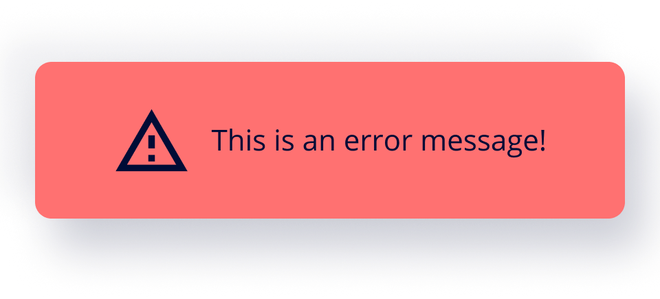
Snackbars
It is used to notify users about the processes
informational
warning
error
success
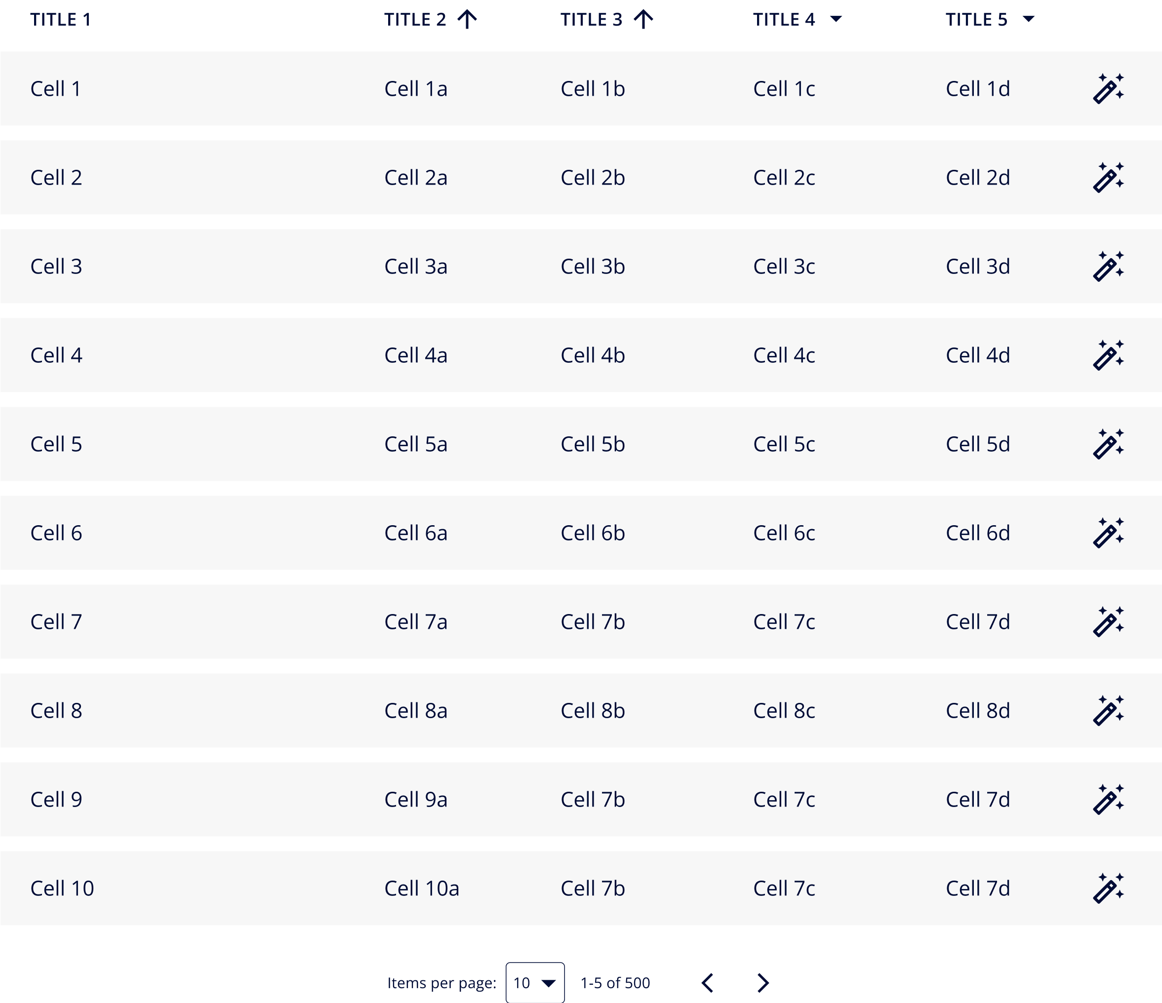
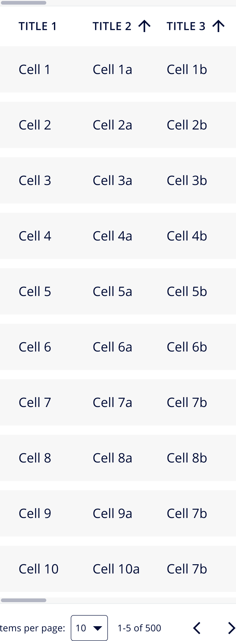
Tables
It is used to display contents in organized way
Text Fields
Text Box Style 1
DEFAULT
Hover
Selected
Disabled
Text Area Fields Style
DEFAULT
Hover
Selected
Disabled
Text Box Style 2
DEFAULT
Hover
Selected
Disabled
Text Area Fields Style 2
DEFAULT
Hover
Selected
Disabled
Tooltips
We use cookies to ensure that we give you the best experience on our website. If you continue to use this site we will assume that you are happy with it.


